How to prepare for a new website is one of the questions I’m asked most often by new clients. If you’re planning a new website, having a simple Website Preparation Checklistcan save you a huge amount of time and frustration.
One of the biggest misconceptions about building a website is that the design comes first.
It doesn’t.
In fact, before I can design a single page, there are a few things I need from you. The funny thing is that most of them have nothing to do with websites.
If you’re wondering how to prepare for a new website, the good news is that you don’t need everything to be perfect before you get started. What you do need is a few key pieces of information that will help your project run smoothly.
How to Prepare for a New Website: What You’ll Need Before Your Project Begins
Before you get started, it’s worth gathering everything in one place.
How to Prepare for a New Website: #1 Your Website Copy
First, let’s look at your website copy….
Most people think they need perfectly written content before speaking to a web designer. That’s simply not true.
What I need is the information that’s already in your head.
Tell me about your business.
Tell me what you do.
Tell me who you help.
Tell me the questions customers ask all the time.
A rough draft is absolutely fine. Bullet points are fine. Notes scribbled on paper are fine.
The hardest part is getting started.
My job is to help shape that information into a website that makes sense to your visitors.
How to Prepare for a New Website: #2 Your Images
Next, you’ll want to gather your images.
That’s why genuine photos of you, your team, your products or your work are always more powerful than generic stock images.
You don’t necessarily need a professional photographer.
In fact, many of my clients provide excellent images taken on a smartphone.
How to Prepare for a New Website: #3 Your Branding
In addition, make sure your branding files are easy to access.
If you already have branding, great.
I’ll need things like:
Your logo
Brand colours
Fonts (if you have them)
Brand guidelines
If you don’t have a full brand package, that’s perfectly fine too.
After all, many small businesses start with a logo and a colour palette.
The goal is to create a website that feels consistent and recognisable.
How to Prepare for a New Website: #4 Access to Existing Accounts
If you already have a website, there may be a few accounts I’ll need access to.
This could include:
Website hosting
Domain name registration
Email accounts
Google Business Profile
Google Analytics
Don’t panic if you don’t know where everything is.
Helping clients track down account details has become an unexpected part of my job over the years!
How to Prepare for a New Website: #5 Your Website Goals
This is the most important one.
What do you want your website to do?
Do you want more enquiries?
Do you want people to book appointments?
Do you want to sell products online?
Do you want to showcase your work?
A website should support your business goals, not simply look nice.
When I understand what success looks like for your business, I can design a website that helps you get there.
The Good News!
You don’t need everything to be perfect before we start.
In fact, waiting for perfection is often what causes the biggest delays.
The clients who make the fastest progress are usually the ones who provide a first draft, knowing we can refine things together.
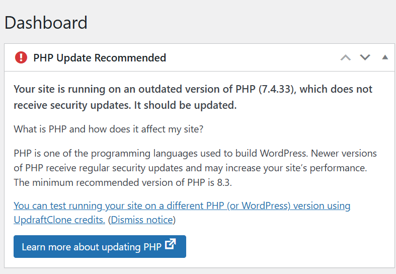
Have you ever come across a message about your website’s PHP version on your WordPress Dashboard and thought… what on earth is that? — you’re not alone.
Did you know that:
👉 It’s one of the most important parts of your website.
And if it’s not up to date, it can cause problems behind the scenes.
It’s the code that runs on your server and builds your website pages.
Every time someone visits your website, PHP is working in the background to:
Pull your content from the database
Run WordPress and your plugins
Process forms and user actions
Generate the page your visitor sees
All in a fraction of a second.
What Does PHP Stand For?
PHP originally stood for “Personal Home Page”.
These days, it’s officially known as a recursive acronym: 👉 “PHP: Hypertext Preprocessor”
(Yes… slightly confusing—but don’t worry, the name matters far less than what it actually does!)
It’s Essential for WordPress Websites
If your website is built on WordPress (like most of the sites I work on), PHP is absolutely essential.
It’s what allows your site to be dynamic, meaning you can:
Update your content easily
Add blog posts
Receive enquiries
Sell products
Manage memberships
Without PHP, your website simply wouldn’t function.
What Happens if PHP is Outdated?
This is where things can start to go wrong…
If your site is running an outdated version:
❌ It becomes less secure
❌ It can slow down
❌ Plugins and themes may stop working properly
❌ You increase the risk of errors or even site crashes
Many older websites are still running PHP 7.4, which is now end-of-life—meaning it no longer receives security updates.
Why Keeping PHP Updated Matters
Updating PHP is one of the simplest ways to improve your website’s:
✔ Speed
✔ Security
✔ Stability
✔ Compatibility with modern plugins
It’s not something your visitors will ever see… but it has a big impact on how your website performs.
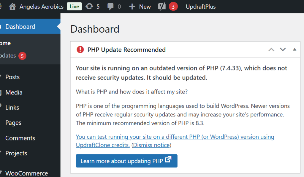
A Real Example (From a Recent Client Migration)
When I recently migrated a client website for Angela’s Aerobics, the site was running on an outdated PHP version.
On the surface, everything looked fine…
But behind the scenes, it meant:
Increased security risk
Reduced performance
Potential compatibility issues
As part of the migration, I upgraded the site to PHP 8.4—bringing it up to date and ensuring it runs smoothly going forward.
What Version Should You Be Using?
Right now, the recommended version for most live websites is:
👉 PHP 8.4
It offers the best balance of:
Stability
Performance
Compatibility
How to Check Your PHP Version
If you’re curious, you can usually check your PHP version in:
Your hosting control panel
Your WordPress dashboard (Tools → Site Health)
If you’re unsure, it’s always worth asking your web designer or hosting provider.
Final Thoughts
PHP might not be something you think about…
But it plays a crucial role in keeping your website running properly.
Keeping it updated is one of those small, behind-the-scenes tasks that makes a big difference to your website’s health.
Need Help Checking Yours?
If you’re not sure what version your website is running—or you’ve seen warnings and don’t know what to do next—
👉 Get in touch and I’ll happily take a look for you.
If you’re wondering about choosing WordPress or Wix for your new website, you’re not alone — it’s one of the most commonly asked questions I get asked as a web designer. The choice between WordPress and Wix depends on your goals, your confidence with tech, and how much control you want over your website. Both platforms have their place — but they serve slightly different types of business owners.
WordPress – Flexible, Scalable, and Built to Grow
Best for: Businesses serious about growth and SEO
Flexibility & Customisation With WordPress, you can build pretty much anything — from brochure sites to full membership platforms.
Full Ownership You own your website, your data, and your hosting. That control is a big deal long-term.
Plugins & SEO Power Tools like Yoast SEO, WooCommerce, and membership plugins give you huge capability.
Scalability Your site can grow with your business — without needing to rebuild from scratch.
Learning Curve There’s more to learn, especially around hosting and updates.
Maintenance You (or your web designer) need to manage updates, security, and backups.
Wix – Simple, Stylish, and Straightforward
Best for: Beginners who want something quick and easy
Ease of Use Wix is incredibly user-friendly. Its drag-and-drop builder makes it easy to create a website without any technical knowledge.
Design There are hundreds of professionally designed templates that help you get a polished website live quickly.
Maintenance Everything is handled for you — hosting, security, updates. It’s very much a “hands-off” experience.
Built-in Features Wix has an all-in-one ecosystem with apps and tools ready to go.
Limitations The trade-off? Flexibility. As your business grows, you may find Wix restrictive when it comes to customisation and advanced functionality.
So… Which One Should You Choose?
If you want something quick, simple, and low-maintenance → Wix is a great starting point.
If you’re building a business and want long-term flexibility, better SEO control, and room to grow → WordPress is the stronger option.
If you’re still not sure which platform is right for you — or you’d love to learn how to build and manage your website properly — that’s exactly why I created the JR Digital Academy.
Inside, I’ll guide you through a step-by-step process, so you can feel confident making the right decisions for your business and actually take control of your website (without the fear).
Recently we carried out a WordPress website rescue after discovering a client’s site had been flooded with 2,229 spam blog posts.
Sometimes a job that looks simple on the surface turns out to reveal much more beneath.
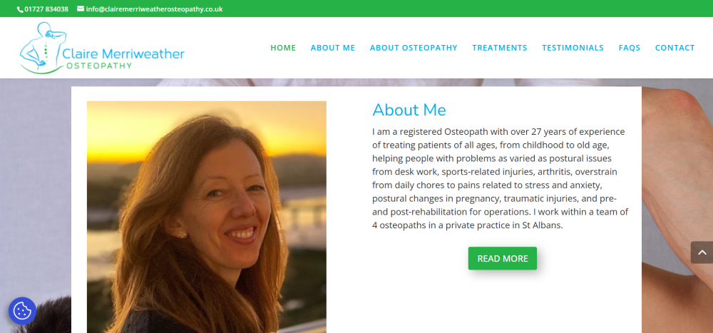
Recently, we were asked to quote for what should have been a straightforward project: migrating a client’s website to a new hosting environment. The client, Claire Merriweather of Claire Merriweather Osteopathy, had become unhappy with the level of service she was receiving from her existing web design company and felt she was paying over the odds for hosting without getting any real support in return.
Nothing unusual there.
However, when we logged into the website dashboard to take a look around, we discovered something rather surprising.
The blog section had been hacked.
And not just a little bit hacked.
A total of 2,229 spam posts had been added to the website.
At that point, what started as a simple migration quickly turned into something much more important: a full website rescue.
What We Discovered
Once inside the site, it became clear that the spam attack wasn’t the only issue. A closer look revealed several problems that had quietly developed over time.
The blog had been left open to spam attacks, which allowed automated bots to flood the website with thousands of junk posts. These posts served no purpose other than to damage the integrity of the site and potentially harm its search engine reputation.
Beyond the spam problem, there were several other issues affecting both usability and design:
The contact form was not functioning properly and displayed random symbols.
The testimonials page wasn’t displaying correctly, leaving large blank areas where reviews should have appeared.
The footer had never been properly designed and still contained the default Elegant Themes template content.
The homepage had not been correctly optimised for mobile devices, which meant visitors on phones were not seeing the best version of the site.
There was no “Back to Top” navigation button, making it harder for visitors to move around the page.
Important website essentials such as privacy policies and GDPR cookie preferences had not been implemented.
None of these issues alone would necessarily break a website. But together they created a site that was slowly becoming less effective, less secure, and more difficult for visitors to use.
Why We Recommended a Rebuild
With over two thousand spam posts embedded within the blog database, cleaning up the site would have been time-consuming and risky. Rather than attempting to patch an ageing setup, we recommended a clean rebuild of the website to the same design specifications as the original.
A rebuild allowed us to create a fresh, secure WordPress installation while preserving the look and feel that the client’s patients were already familiar with.
This approach ensured that the website would be stable, easier to manage, and protected against future spam attacks.
What We Fixed and Improved
During the rebuild process, we addressed both the technical issues and the usability improvements that had been missing from the original site.
Security and stability improvements
Removed all spam blog content
Installed preventative anti-spam protection to stop future attacks
Created a fresh, clean WordPress installation
Design and usability improvements
Designed a proper footer layout including contact details, opening hours and a Google Maps location link
Fixed the testimonials page so client reviews display correctly
Repaired the contact form so enquiries can be submitted without errors
Added a Back to Top button to improve navigation on longer pages
Increased the universal body text size to 16pt for better readability
Implemented a fixed header on mobile devices for easier navigation
Essential website additions
Added a Privacy Policy page
Installed a GDPR cookie preferences plugin
Connected the site to Google Site Kit
Implemented YOAST SEO to improve search engine visibility
From a visitor’s perspective, the website now looks very similar to the original version. But behind the scenes, it is now significantly more secure, easier to manage, and properly configured to support the business moving forward.
What This Story Tells Us About Many Websites
One thing we see quite often is that websites rarely fail in dramatic ways.
Instead, small issues quietly build up over time.
Plugins become outdated. Security gaps appear. Forms stop working. Design elements are left unfinished. Spam finds its way in.
And because these problems happen gradually, they often go unnoticed until someone finally takes a closer look inside the website dashboard.
This is why regular website maintenance, security checks and occasional updates are so important.
A Simple Website Health Check
If you run a business website, it’s worth asking yourself a few simple questions:
When was the last time you logged into your website dashboard?
Do you know where your website is hosted?
Is your contact form definitely working?
Are your plugins and security tools up to date?
Would you know if something had gone wrong behind the scenes?
These things are easy to overlook, especially when you’re busy running a business.
But as this story shows, a quick check can sometimes reveal issues that are well worth fixing.
If you would like a fresh pair of eyes on your website, we’re always happy to take a look and point out anything that might need attention.
Sometimes it’s just a small tweak.
And occasionally… it turns into a full website rescue.
Jacquie was a delight to work with! She arranged the transfer and tidy up of my website, liaising with my previous provider and making the whole process easy. She is friendly yet professional and I feel confident that she will do a great job in helping maintain my website in the future. Thank you! Claire Merriweather
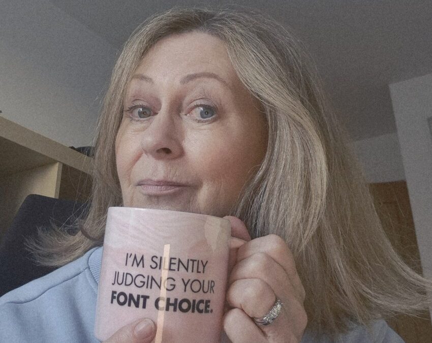
When reviewing client websites, one issue appears again and again.
The text is simply too difficult to read.
Sometimes the font size is too small. Sometimes the spacing is too tight. And sometimes there are too many fonts competing for attention.
Typography might seem like a small design detail, but it has a huge impact on how visitors experience your website.
Clear, well-structured text helps your website feel more professional, easier to read and more trustworthy.
The good news is that there’s one simple fix that can dramatically improve your website readability.
Start With the Right Font Size
If your body text is too small, visitors have to work harder to read your content.
And when people have to work too hard to read something online, they usually leave.
For most websites, the recommended body text size is:
16px – 18px
This range is widely accepted as the most comfortable reading size for websites and works well across both desktop and mobile screens.
Anything smaller than 16px can quickly become difficult to read, especially on phones.
Spacing Makes a Big Difference
Font size is only part of the picture.
Line spacing also plays an important role in readability.
When lines of text are too close together, the page feels cramped and overwhelming.
For most websites, a line height between 1.5 and 1.7 works best. This gives text enough breathing room and makes it much easier for visitors to read longer sections of content.
Keep Your Font Choices Simple
Another common mistake I see on websites is using too many fonts.
While it might seem like a good idea to mix different styles, this often makes a website look cluttered and inconsistent.
A simple approach usually works best:
• one font for headings • one font for body text • an optional accent font if needed
In most cases, two fonts are more than enough.
Fonts such as Open Sans, Montserrat, Lato and Poppins are popular choices because they are clean, modern and highly readable on screens.
Don’t Forget Mobile Users
Today, more than half of website traffic comes from mobile devices.
That means your typography must work just as well on a phone as it does on a desktop.
Before publishing any changes to your website, always check how your text looks on a mobile screen. If visitors need to zoom in to read your content, it’s a clear sign the text is too small.
Download our Free Font Size Guide
If you’re unsure what font sizes your website should be using, I’ve created a simple resource to help.
The Perfect Website Font Size Guide
This quick reference guide shows the recommended font sizes for headings, body text and mobile screens, making it easy to create a website that is clear, professional and comfortable to read.
You’ll also receive a companion guide:
7 Typography Mistakes to Avoid on Your Website
These are some of the most common typography problems I see when reviewing client websites, along with simple fixes that instantly improve readability.
Typography might not always be the first thing people notice on a website, but it quietly shapes how visitors experience your content.
When your text is clear, well spaced and easy to read, your website immediately feels more professional and trustworthy.
And sometimes, a small change like adjusting your font size can make a surprisingly big difference.
I help small business owners build, manage and improve their websites without the tech overwhelm.With over 30 years in the design world (and a lifelong love of typography), I’m passionate about helping business owners create websites that are clear, professional and easy to use.
And yes… I really am silently judging your font choices.