WordPress Website Rescue: Fixing 2,229 Spam Posts
A WordPress Website Rescue: What We Found
Recently we carried out a WordPress website rescue after discovering a client’s site had been flooded with 2,229 spam blog posts.
Sometimes a job that looks simple on the surface turns out to reveal much more beneath.
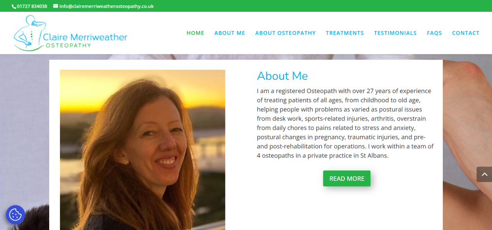
Recently, we were asked to quote for what should have been a straightforward project: migrating a client’s website to a new hosting environment. The client, Claire Merriweather of Claire Merriweather Osteopathy, had become unhappy with the level of service she was receiving from her existing web design company and felt she was paying over the odds for hosting without getting any real support in return.
Nothing unusual there.
However, when we logged into the website dashboard to take a look around, we discovered something rather surprising.
The blog section had been hacked.
And not just a little bit hacked.
A total of 2,229 spam posts had been added to the website.
At that point, what started as a simple migration quickly turned into something much more important: a full website rescue.
What We Discovered
Once inside the site, it became clear that the spam attack wasn’t the only issue. A closer look revealed several problems that had quietly developed over time.
The blog had been left open to spam attacks, which allowed automated bots to flood the website with thousands of junk posts. These posts served no purpose other than to damage the integrity of the site and potentially harm its search engine reputation.
Beyond the spam problem, there were several other issues affecting both usability and design:
- The contact form was not functioning properly and displayed random symbols.
- The testimonials page wasn’t displaying correctly, leaving large blank areas where reviews should have appeared.
- The footer had never been properly designed and still contained the default Elegant Themes template content.
- The homepage had not been correctly optimised for mobile devices, which meant visitors on phones were not seeing the best version of the site.
- There was no “Back to Top” navigation button, making it harder for visitors to move around the page.
- Important website essentials such as privacy policies and GDPR cookie preferences had not been implemented.
None of these issues alone would necessarily break a website. But together they created a site that was slowly becoming less effective, less secure, and more difficult for visitors to use.
Why We Recommended a Rebuild
With over two thousand spam posts embedded within the blog database, cleaning up the site would have been time-consuming and risky. Rather than attempting to patch an ageing setup, we recommended a clean rebuild of the website to the same design specifications as the original.
A rebuild allowed us to create a fresh, secure WordPress installation while preserving the look and feel that the client’s patients were already familiar with.
This approach ensured that the website would be stable, easier to manage, and protected against future spam attacks.
What We Fixed and Improved
During the rebuild process, we addressed both the technical issues and the usability improvements that had been missing from the original site.
Security and stability improvements
- Removed all spam blog content
- Installed preventative anti-spam protection to stop future attacks
- Created a fresh, clean WordPress installation
Design and usability improvements
- Designed a proper footer layout including contact details, opening hours and a Google Maps location link
- Fixed the testimonials page so client reviews display correctly
- Repaired the contact form so enquiries can be submitted without errors
- Added a Back to Top button to improve navigation on longer pages
- Increased the universal body text size to 16pt for better readability
- Implemented a fixed header on mobile devices for easier navigation
Essential website additions
- Added a Privacy Policy page
- Installed a GDPR cookie preferences plugin
- Connected the site to Google Site Kit
- Implemented YOAST SEO to improve search engine visibility
From a visitor’s perspective, the website now looks very similar to the original version. But behind the scenes, it is now significantly more secure, easier to manage, and properly configured to support the business moving forward.
What This Story Tells Us About Many Websites
One thing we see quite often is that websites rarely fail in dramatic ways.
Instead, small issues quietly build up over time.
Plugins become outdated.
Security gaps appear.
Forms stop working.
Design elements are left unfinished.
Spam finds its way in.
And because these problems happen gradually, they often go unnoticed until someone finally takes a closer look inside the website dashboard.
This is why regular website maintenance, security checks and occasional updates are so important.
A Simple Website Health Check
If you run a business website, it’s worth asking yourself a few simple questions:
- When was the last time you logged into your website dashboard?
- Do you know where your website is hosted?
- Is your contact form definitely working?
- Are your plugins and security tools up to date?
- Would you know if something had gone wrong behind the scenes?
These things are easy to overlook, especially when you’re busy running a business.
But as this story shows, a quick check can sometimes reveal issues that are well worth fixing.
If you would like a fresh pair of eyes on your website, we’re always happy to take a look and point out anything that might need attention.
Sometimes it’s just a small tweak.
And occasionally… it turns into a full website rescue.
Jacquie was a delight to work with! She arranged the transfer and tidy up of my website, liaising with my previous provider and making the whole process easy. She is friendly yet professional and I feel confident that she will do a great job in helping maintain my website in the future. Thank you! Claire Merriweather