How to prepare for a new website is one of the questions I’m asked most often by new clients. If you’re planning a new website, having a simple Website Preparation Checklistcan save you a huge amount of time and frustration.
One of the biggest misconceptions about building a website is that the design comes first.
It doesn’t.
In fact, before I can design a single page, there are a few things I need from you. The funny thing is that most of them have nothing to do with websites.
If you’re wondering how to prepare for a new website, the good news is that you don’t need everything to be perfect before you get started. What you do need is a few key pieces of information that will help your project run smoothly.
How to Prepare for a New Website: What You’ll Need Before Your Project Begins
Before you get started, it’s worth gathering everything in one place.
How to Prepare for a New Website: #1 Your Website Copy
First, let’s look at your website copy….
Most people think they need perfectly written content before speaking to a web designer. That’s simply not true.
What I need is the information that’s already in your head.
Tell me about your business.
Tell me what you do.
Tell me who you help.
Tell me the questions customers ask all the time.
A rough draft is absolutely fine. Bullet points are fine. Notes scribbled on paper are fine.
The hardest part is getting started.
My job is to help shape that information into a website that makes sense to your visitors.
How to Prepare for a New Website: #2 Your Images
Next, you’ll want to gather your images.
That’s why genuine photos of you, your team, your products or your work are always more powerful than generic stock images.
You don’t necessarily need a professional photographer.
In fact, many of my clients provide excellent images taken on a smartphone.
How to Prepare for a New Website: #3 Your Branding
In addition, make sure your branding files are easy to access.
If you already have branding, great.
I’ll need things like:
Your logo
Brand colours
Fonts (if you have them)
Brand guidelines
If you don’t have a full brand package, that’s perfectly fine too.
After all, many small businesses start with a logo and a colour palette.
The goal is to create a website that feels consistent and recognisable.
How to Prepare for a New Website: #4 Access to Existing Accounts
If you already have a website, there may be a few accounts I’ll need access to.
This could include:
Website hosting
Domain name registration
Email accounts
Google Business Profile
Google Analytics
Don’t panic if you don’t know where everything is.
Helping clients track down account details has become an unexpected part of my job over the years!
How to Prepare for a New Website: #5 Your Website Goals
This is the most important one.
What do you want your website to do?
Do you want more enquiries?
Do you want people to book appointments?
Do you want to sell products online?
Do you want to showcase your work?
A website should support your business goals, not simply look nice.
When I understand what success looks like for your business, I can design a website that helps you get there.
The Good News!
You don’t need everything to be perfect before we start.
In fact, waiting for perfection is often what causes the biggest delays.
The clients who make the fastest progress are usually the ones who provide a first draft, knowing we can refine things together.
If you’re wondering about choosing WordPress or Wix for your new website, you’re not alone — it’s one of the most commonly asked questions I get asked as a web designer. The choice between WordPress and Wix depends on your goals, your confidence with tech, and how much control you want over your website. Both platforms have their place — but they serve slightly different types of business owners.
WordPress – Flexible, Scalable, and Built to Grow
Best for: Businesses serious about growth and SEO
Flexibility & Customisation With WordPress, you can build pretty much anything — from brochure sites to full membership platforms.
Full Ownership You own your website, your data, and your hosting. That control is a big deal long-term.
Plugins & SEO Power Tools like Yoast SEO, WooCommerce, and membership plugins give you huge capability.
Scalability Your site can grow with your business — without needing to rebuild from scratch.
Learning Curve There’s more to learn, especially around hosting and updates.
Maintenance You (or your web designer) need to manage updates, security, and backups.
Wix – Simple, Stylish, and Straightforward
Best for: Beginners who want something quick and easy
Ease of Use Wix is incredibly user-friendly. Its drag-and-drop builder makes it easy to create a website without any technical knowledge.
Design There are hundreds of professionally designed templates that help you get a polished website live quickly.
Maintenance Everything is handled for you — hosting, security, updates. It’s very much a “hands-off” experience.
Built-in Features Wix has an all-in-one ecosystem with apps and tools ready to go.
Limitations The trade-off? Flexibility. As your business grows, you may find Wix restrictive when it comes to customisation and advanced functionality.
So… Which One Should You Choose?
If you want something quick, simple, and low-maintenance → Wix is a great starting point.
If you’re building a business and want long-term flexibility, better SEO control, and room to grow → WordPress is the stronger option.
If you’re still not sure which platform is right for you — or you’d love to learn how to build and manage your website properly — that’s exactly why I created the JR Digital Academy.
Inside, I’ll guide you through a step-by-step process, so you can feel confident making the right decisions for your business and actually take control of your website (without the fear).
When reviewing client websites, one issue appears again and again.
The text is simply too difficult to read.
Sometimes the font size is too small. Sometimes the spacing is too tight. And sometimes there are too many fonts competing for attention.
Typography might seem like a small design detail, but it has a huge impact on how visitors experience your website.
Clear, well-structured text helps your website feel more professional, easier to read and more trustworthy.
The good news is that there’s one simple fix that can dramatically improve your website readability.
Start With the Right Font Size
If your body text is too small, visitors have to work harder to read your content.
And when people have to work too hard to read something online, they usually leave.
For most websites, the recommended body text size is:
16px – 18px
This range is widely accepted as the most comfortable reading size for websites and works well across both desktop and mobile screens.
Anything smaller than 16px can quickly become difficult to read, especially on phones.
Spacing Makes a Big Difference
Font size is only part of the picture.
Line spacing also plays an important role in readability.
When lines of text are too close together, the page feels cramped and overwhelming.
For most websites, a line height between 1.5 and 1.7 works best. This gives text enough breathing room and makes it much easier for visitors to read longer sections of content.
Keep Your Font Choices Simple
Another common mistake I see on websites is using too many fonts.
While it might seem like a good idea to mix different styles, this often makes a website look cluttered and inconsistent.
A simple approach usually works best:
• one font for headings • one font for body text • an optional accent font if needed
In most cases, two fonts are more than enough.
Fonts such as Open Sans, Montserrat, Lato and Poppins are popular choices because they are clean, modern and highly readable on screens.
Don’t Forget Mobile Users
Today, more than half of website traffic comes from mobile devices.
That means your typography must work just as well on a phone as it does on a desktop.
Before publishing any changes to your website, always check how your text looks on a mobile screen. If visitors need to zoom in to read your content, it’s a clear sign the text is too small.
Download our Free Font Size Guide
If you’re unsure what font sizes your website should be using, I’ve created a simple resource to help.
The Perfect Website Font Size Guide
This quick reference guide shows the recommended font sizes for headings, body text and mobile screens, making it easy to create a website that is clear, professional and comfortable to read.
You’ll also receive a companion guide:
7 Typography Mistakes to Avoid on Your Website
These are some of the most common typography problems I see when reviewing client websites, along with simple fixes that instantly improve readability.
Typography might not always be the first thing people notice on a website, but it quietly shapes how visitors experience your content.
When your text is clear, well spaced and easy to read, your website immediately feels more professional and trustworthy.
And sometimes, a small change like adjusting your font size can make a surprisingly big difference.
I help small business owners build, manage and improve their websites without the tech overwhelm.With over 30 years in the design world (and a lifelong love of typography), I’m passionate about helping business owners create websites that are clear, professional and easy to use.
And yes… I really am silently judging your font choices.
There’s nothing worse than having a lovely new website… and then feeling scared to touch it. My aim is always to hand over a site that clients can actually use, manage, and grow themselves.
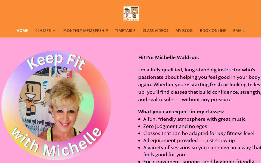
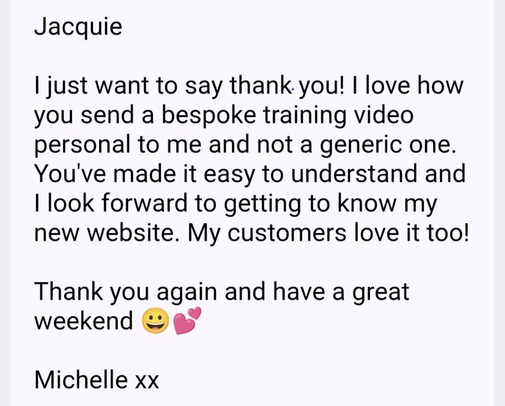
Michelle came to us with a website that had served her business for nearly 20 years. It had done its job well, but it was starting to look dated, wasn’t mobile-friendly, and was tricky for her to update. She wanted something fresh and modern — but still familiar to her long-standing clients.
We rebuilt the site on WordPress, keeping the structure people recognised while giving it a clean, mobile-friendly design. Using her existing logo, I created a bright, energetic colour palette and built the look of the site around her brand.
Her six class types are now clearly organised in a simple menu, making it easy for visitors to find what they need. We also added:
Links to her Trustpilot reviews
A direct link to view her Google reviews
A Google Map showing class locations
A brand new Blog so she can share updates and fitness tips
We also carried out foundational SEO work on the homepage — setting page titles, descriptions, and key local search terms — so the site has a strong starting point for being found on Google.
And of course, once the site launched, Michelle received her training.
She now has:
Recorded videos showing how to update text and photos
A walkthrough on creating blog posts
A one-hour training session to build confidence using the site
The result is a modern, easy-to-use website that Michelle can update herself whenever her timetable or classes change .
That’s our goal:
A website that looks great, works hard for your business, and that you feel confident managing.
“Great service and communication from Jacquie in creating my new website. I am absolutely delighted with it. Highly recommended.”
It’s so easy to grab a picture online and pop it onto your website. But recently one of my clients received a copyright claim for using an image that wasn’t properly licensed.
Copyright compliance is serious business. Companies like Immediate Mediaand Image Professionalsactively monitor websites to catch unlicensed image use. Even if the image was added by a designer, a template, or a blog contributor — you (the website owner) are the one legally responsible.
Here’s how to stay safe:
✅ Only use properly licensed images — from trusted sources such as Canva, Shutterstock, iStock, Pexels, or your own photography. ✅ Double-check “free” sites — not all free image libraries allow commercial use. Always read the licence terms. ✅ Keep proof of your licences — save receipts, invoices, or screenshots of where the image was sourced. ✅ Avoid Google Images entirely — it’s not a stock library, even if it looks like one! ✅ Limit image file size — for website performance, never upload images larger than 1MB. Large images slow down your site and can even affect Google rankings. Compress images before uploading while keeping them sharp and clear. ✅ If you’re unsure — ask me. I can help you check whether your site’s images are compliant.
A quick tip…
If you had your website built years ago or you’ve added images over time, it’s worth doing a quick audit now. Removing or replacing unlicensed images could save you hundreds of pounds later.
Need help?…
If you’d like me to review your site’s image use or show you where to find safe, high-quality visuals, just reply to this email. It’s an easy fix that can prevent a costly headache.
Download our FREE Guide on how to correctly format your images for your website.
From large banners to small thumbnails, using the correct dimensions and formats will avoid blurry images, slow load times, messy layouts and an overloaded website and server! Once you’ve selected your images for your website you need this guide.