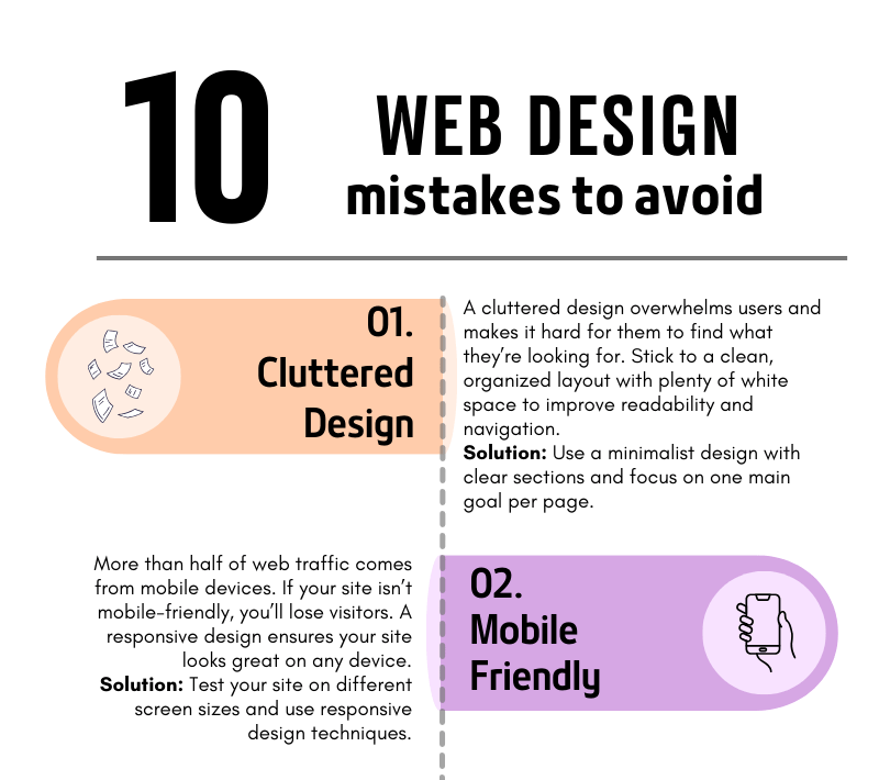
A comprehensive rundown of key web design mistakes and how to fix them!
10 Common Web Design Mistakes to Avoid
Your website is often the first impression people get of your business. A poorly designed website can turn visitors away, but a well-thought-out design can convert visitors into customers. To help you build a site that stands out for all the right reasons, we’ve compiled a list of the 10 most common web design mistakes to avoid.
1. Cluttered Design
A cluttered design overwhelms users and makes navigation difficult. When visitors land on your site, they should be able to quickly find what they need without being bombarded with too much information. Less is often more!
How to fix it: Use plenty of white space, clear sections, and focus on one main goal per page. A clean and simple layout will make your site more user-friendly and visually appealing.
2. Not Mobile-Friendly
In today’s mobile-first world, having a website that doesn’t adapt to different screen sizes is a huge mistake. More than half of web traffic comes from mobile devices, so if your website isn’t responsive, you’re missing out on potential customers.
How to fix it: Test your site on various screen sizes, from mobile phones to tablets, and ensure it looks and functions well across all devices.
3. Slow Loading Speed
A slow website can frustrate visitors and drive them away before they even see your content. People expect websites to load quickly—ideally in under three seconds.
How to fix it: Compress large images, reduce the number of plugins, and use a fast, reliable hosting service. These steps can dramatically improve your site’s loading time.
4. Poor Navigation
If visitors can’t find what they’re looking for, they’ll leave. Your navigation should be simple, clear, and intuitive, helping users move around your site effortlessly.
How to fix it: Limit the number of menu items, use clear labels, and make sure every link works as expected. Always guide your visitors toward the most important content.
5. Ignoring SEO
You might have the best website in the world, but if no one can find it, it’s not doing its job. Search Engine Optimization (SEO) helps your site appear in search results, driving organic traffic.
How to fix it: Incorporate relevant keywords, create SEO-friendly titles and meta descriptions, and use image alt tags. This will help improve your rankings on search engines like Google.
6. Lack of a Clear Call-to-Action (CTA)
If your website doesn’t tell visitors what to do next, they’ll likely leave without taking action. A strong call-to-action guides users toward your goals—whether that’s signing up for a newsletter, making a purchase, or contacting you.
How to fix it: Place clear, bold CTAs on every page, encouraging users to take the next step. Be specific about what you want them to do.
7. Too Much Text
Long paragraphs and blocks of text can overwhelm readers. People scan web content quickly, so keep your text concise and to the point.
How to fix it: Break your content into smaller sections, use bullet points, and include images or icons to make the content more digestible.
8. Inconsistent Branding
Your website is an extension of your brand. If your colors, fonts, and tone of voice vary from page to page, it confuses users and makes your brand appear unprofessional.
How to fix it: Establish a brand style guide and ensure that your fonts, colors, and imagery are consistent across all pages.
9. Overuse of Pop-ups
Pop-ups can be helpful when used correctly, but too many—or ones that appear at the wrong time—can annoy visitors and cause them to leave your site.
How to fix it: Use pop-ups sparingly and ensure they don’t cover the main content too quickly. Only use them for important information, such as special offers or newsletter sign-ups.
10. Neglecting Website Maintenance
A website is never truly “finished.” Regular maintenance ensures your site stays secure, functional, and up to date. Neglecting updates can lead to broken links, security vulnerabilities, and an outdated user experience.
How to fix it: Schedule regular maintenance checks, update plugins, review content for relevancy, and ensure your site’s security is always up to par.
Final Thoughts
By avoiding these common web design mistakes, you’ll ensure that your website is not only visually appealing but also functional, easy to navigate, and optimized for both search engines and user experience. A well-designed site can make a world of difference in turning visitors into loyal customers!
If you’re ready to create a website that works for your business, avoid these pitfalls and set yourself up for success. And if you need help along the way, feel free to reach out!

