
by JR Digital Design | Oct 30, 2024 | Design Brief, Web Design
If you’ve ever found yourself saying things like, “Make it pop!” or “I’ll know it when I see it,” you’re not alone! But here’s the thing – these phrases are more likely to make your designer scratch their head than spark creativity.
Don’t worry; I get it. Knowing exactly what you want (and how to communicate it) can be challenging. That’s why I’m here to break down the art of the perfect designer brief – making it easier for you to get exactly what you want and for us to make it happen. Let’s dive in!…
Step 1: Start with Your Audience
Who’s this website for? Instead of saying, “I want it to look cool,” think about who will visit your site. Are they tech-savvy millennials? Busy moms? Entrepreneurs? Knowing your target audience will help shape the website’s style and tone. A designer can work magic with audience insights!
Pro Tip: Share specific details, like “My audience is entrepreneurs in their 30s looking for quick, impactful advice.”
Step 2: Be Real with Your Vision
The best web design isn’t about “just a vibe”; it’s about purpose. Imagine how you want visitors to feel and act on your site. Do you want them to sign up, feel inspired, or maybe explore your offerings? By giving your designer a feel for the action and emotion you want to inspire, they can create a visual experience to match. More on this and my upcoming Mailerlite workshop in my next newsletter!
Step 3: Colors and Fonts? Yes, They Matter!
Here’s a fun one: Color and font choices aren’t just preferences – they’re about brand personality! If you’re unsure, start by telling your designer how you want your brand to feel. Is it bold and energetic? Calm and sophisticated? Sharing websites you admire or pointing out specific colors that resonate with you helps a ton.
Pro Tip: Avoid Comic Sans. Just… trust me on this one.
Step 4: Bring Examples You Like
Designers love examples. It’s like giving us a map to your happy place! Websites, color palettes, layouts – anything visual that catches your eye can serve as an inspiration guide. Just remember, it’s not about copying; it’s about capturing that spark of inspiration and making it uniquely yours.
Step 5: Streamline Feedback
You might think, “A little tweak here, one more tweak there…” but soon you’re knee-deep in revision overload! To keep the process smooth, gather feedback all at once and communicate changes clearly. This saves time, money, and sanity for both you and your designer. Trust me, your dream website is just around the corner!
Ready to build your dream site?
With these tips, you’re well on your way to making it happen – without the “make it pop!” confusion. When you’re ready for the next step, I’m here to help bring your vision to life, loud and clear.
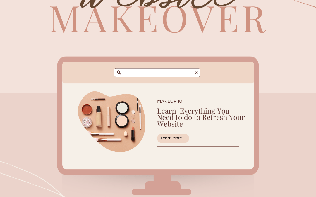
by JR Digital Design | Oct 23, 2024 | Web Design, Website Makeover
When was the last time you gave your website a serious look? If your answer is “a while ago” or “I can’t remember,” it might be time for a website makeover. Like your wardrobe or your home decor, your website needs refreshing now and then. But how do you know when it’s the right time? Here are some telltale signs that your website could use a revamp.
1. Your Design Looks Outdated
Trends in web design move fast, and what looked great five years ago can feel outdated now. If your site is starting to look outdated, it’s time for a refresh.
Ask yourself:
- Does your design feel cluttered or old-fashioned?
- Are the fonts and colors up-to-date and aligned with current trends?
- Is your layout easy to navigate, or do users get frustrated trying to find what they need?
An outdated design not only affects your credibility but also how long visitors stay on your site. A fresh, modern look can make a huge difference in how people perceive your business.
2. Your Content Feels Stale
Websites are living, breathing things. If the content on your site hasn’t been updated in a while, it’s probably time to give it some love.
Signs your content needs a refresh:
- You’re still showcasing old products or services you no longer offer.
- Your blog hasn’t seen a new post in months (or years!).
- The language on your site doesn’t reflect your current brand voice or business direction.
Refreshing your content – whether it’s rewriting your about page, adding a blog post, or updating your service descriptions – can breathe new life into your website.
3. It’s Not Mobile-Friendly
If your website doesn’t look good on mobile devices, you’re definitely overdue for a makeover. With more people browsing on their phones than ever before, having a mobile-friendly website is crucial.
Check your mobile responsiveness:
- Is your website easy to navigate on a phone or tablet?
- Do images load properly, and is text easy to read without zooming in?
- Are buttons and links big enough to tap?
If your site isn’t optimised for mobile, you’re likely losing visitors – and potential customers – before they even have a chance to explore what you offer.
4. Your Site is Slow
A slow website is one of the fastest ways to turn visitors away. If your pages take too long to load, people are more likely to hit the “back” button and move on to your competitors.
Test your site speed:
- Does it take more than a couple of seconds for your pages to load?
- Are images or videos slowing things down?
A site that loads quickly provides a better user experience and is more likely to rank higher on search engines, giving you an edge over the competition.
5. Your Branding Has Changed
If your business has evolved but your website hasn’t caught up, it’s time for a makeover. Your website should be a true reflection of your brand today, not where you were five years ago.
Ask yourself:
- Have you updated your logo, colors, or fonts recently?
- Are your website images and messaging aligned with your current target audience?
- Does your website still reflect your core values and business goals?
Consistency across all platforms is key. Your website should align with your social media, marketing materials, and overall brand identity.
6. You’re Embarrassed to Share It
Let’s be honest—if you find yourself hesitant to give out your website link, it’s a pretty clear sign that you need a makeover. Your website should be something you’re proud to show off, whether it’s to clients, collaborators, or anyone interested in what you do.
If you’re not eager to share it because it feels outdated, slow, or unprofessional, it’s time for a revamp that makes you excited to spread the word.
7. Your Conversions Are Dropping
If your website traffic is steady but conversions are falling, your site might not be doing its job. Whether you’re trying to get visitors to fill out a form, sign up for a newsletter, or make a purchase, the design and user experience should be optimised for those goals.
Consider the following:
- Are call-to-action buttons easy to find and compelling?
- Is your checkout process or contact form straightforward and user-friendly?
- Are visitors finding what they need quickly, or do they get lost along the way?
Improving these aspects can help you turn visitors into customers and boost your bottom line.
Your website is often the first point of contact between you and your customers, and it needs to represent your business in the best light possible. If any of these signs ring true, it’s time to consider a makeover. With a refreshed design, updated content, and better functionality, your site can work harder for you and help take your business to the next level.
Are You Ready for a Website Makeover? Let’s Make It Happen!
Your website should be working for your business, not holding it back. If you’re seeing the signs that it’s time for a refresh, don’t wait any longer! A modern, fast, and mobile-friendly website will help you stand out, attract more clients, and grow your business.
Let’s chat about how we can transform your website into something you’re proud to share. Whether you need a few tweaks or a full redesign, I’ll guide you every step of the way.
Get in touch to schedule a free chat and let’s get started!
by JR Digital Design | Oct 16, 2024 | Web Content, Web Design, Website Maintenance
A comprehensive rundown of key web design mistakes and how to fix them!
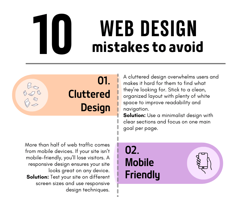
10 Common Web Design Mistakes to Avoid
Your website is often the first impression people get of your business. A poorly designed website can turn visitors away, but a well-thought-out design can convert visitors into customers. To help you build a site that stands out for all the right reasons, we’ve compiled a list of the 10 most common web design mistakes to avoid.
1. Cluttered Design
A cluttered design overwhelms users and makes navigation difficult. When visitors land on your site, they should be able to quickly find what they need without being bombarded with too much information. Less is often more!
How to fix it: Use plenty of white space, clear sections, and focus on one main goal per page. A clean and simple layout will make your site more user-friendly and visually appealing.
2. Not Mobile-Friendly
In today’s mobile-first world, having a website that doesn’t adapt to different screen sizes is a huge mistake. More than half of web traffic comes from mobile devices, so if your website isn’t responsive, you’re missing out on potential customers.
How to fix it: Test your site on various screen sizes, from mobile phones to tablets, and ensure it looks and functions well across all devices.
3. Slow Loading Speed
A slow website can frustrate visitors and drive them away before they even see your content. People expect websites to load quickly—ideally in under three seconds.
How to fix it: Compress large images, reduce the number of plugins, and use a fast, reliable hosting service. These steps can dramatically improve your site’s loading time.
4. Poor Navigation
If visitors can’t find what they’re looking for, they’ll leave. Your navigation should be simple, clear, and intuitive, helping users move around your site effortlessly.
How to fix it: Limit the number of menu items, use clear labels, and make sure every link works as expected. Always guide your visitors toward the most important content.
5. Ignoring SEO
You might have the best website in the world, but if no one can find it, it’s not doing its job. Search Engine Optimization (SEO) helps your site appear in search results, driving organic traffic.
How to fix it: Incorporate relevant keywords, create SEO-friendly titles and meta descriptions, and use image alt tags. This will help improve your rankings on search engines like Google.
6. Lack of a Clear Call-to-Action (CTA)
If your website doesn’t tell visitors what to do next, they’ll likely leave without taking action. A strong call-to-action guides users toward your goals—whether that’s signing up for a newsletter, making a purchase, or contacting you.
How to fix it: Place clear, bold CTAs on every page, encouraging users to take the next step. Be specific about what you want them to do.
7. Too Much Text
Long paragraphs and blocks of text can overwhelm readers. People scan web content quickly, so keep your text concise and to the point.
How to fix it: Break your content into smaller sections, use bullet points, and include images or icons to make the content more digestible.
8. Inconsistent Branding
Your website is an extension of your brand. If your colors, fonts, and tone of voice vary from page to page, it confuses users and makes your brand appear unprofessional.
How to fix it: Establish a brand style guide and ensure that your fonts, colors, and imagery are consistent across all pages.
9. Overuse of Pop-ups
Pop-ups can be helpful when used correctly, but too many—or ones that appear at the wrong time—can annoy visitors and cause them to leave your site.
How to fix it: Use pop-ups sparingly and ensure they don’t cover the main content too quickly. Only use them for important information, such as special offers or newsletter sign-ups.
10. Neglecting Website Maintenance
A website is never truly “finished.” Regular maintenance ensures your site stays secure, functional, and up to date. Neglecting updates can lead to broken links, security vulnerabilities, and an outdated user experience.
How to fix it: Schedule regular maintenance checks, update plugins, review content for relevancy, and ensure your site’s security is always up to par.
Final Thoughts
By avoiding these common web design mistakes, you’ll ensure that your website is not only visually appealing but also functional, easy to navigate, and optimized for both search engines and user experience. A well-designed site can make a world of difference in turning visitors into loyal customers!
If you’re ready to create a website that works for your business, avoid these pitfalls and set yourself up for success. And if you need help along the way, feel free to reach out!